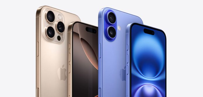
As I have often written here on these pages, Apple doesn’t do drastic. If it is not introducing an entirely different product, then most of the time — although there are exceptions — it tweaks and improves and makes subtle but significant changes to its products. The iPhone 16 and the iPhone 16 Pro phones, which launched last night at Apple’s Glowtime event at Steve Jobs Theatre, exemplifies this approach. As I looked at them in the demo zone and used them briefly, very briefly, my impression of the iPhone 16 and the iPhone 16 Pro was that: okay, they don’t look all that different. Yet, these are phones with some significant upgrades. First, what has not changed. If I compare with the iPhone 15 phones, the iPhone 16 and the iPhone 16 Pro don’t seem much changed in terms of looks and design. Same flat sides, similar aluminium and titanium frames, similar ceramic shield on both the screen and the back. The differences, when there are a few, are fairly minor in terms of looks and feel. The iPhone 16 now has vertically stacked camera lenses, so when the phone is held in landscape mode and its camera is used to record video, the two lenses can work together to capture spatial footage.The iPhone 16 also gets two new buttons — the action button, which was earlier available on the Pro models. And the camera button — Apple is calling it Camera Control — which is new to all iPhone 16 phones. The screen size and resolution is the same, although Apple says that the ceramic shield on the front is now 2X stronger than what Android phone makers use and 50 per cent stronger than what Apple used earlier.
- Satellite-GSAT-17-93.5
- D/L Frequency-4085 MHz
- Symbol Rate-30.0 MSPS
- FEC-5/6
- Roll of 20%
- D/L Polarization-Vertical
- About Us
- Disclaimer
- Contact for Advertisements
- Grievance Redressal
- Help
- Privacy Policy
- Terms & conditions
- JK 24X7News
- JK Media
- JK Newspoint
- Jammu Parivartan
Gulistan TV Network private Ltd is a non government company which was incorporated on 27 Oct, 2008. It focuses towards providing innovative creativity through its enterprising endeavor- “GULISTAN NEWS”.
Contact us: info@gulistannewstv.com


